Enhancements
The ENHANCEMENTS menu is displayed when clicking the second button on the left menu and it is hidden when clicking this same button again. This menu lets you apply different layers to the existing process views, which highlight information that may be interesting for your analysis.
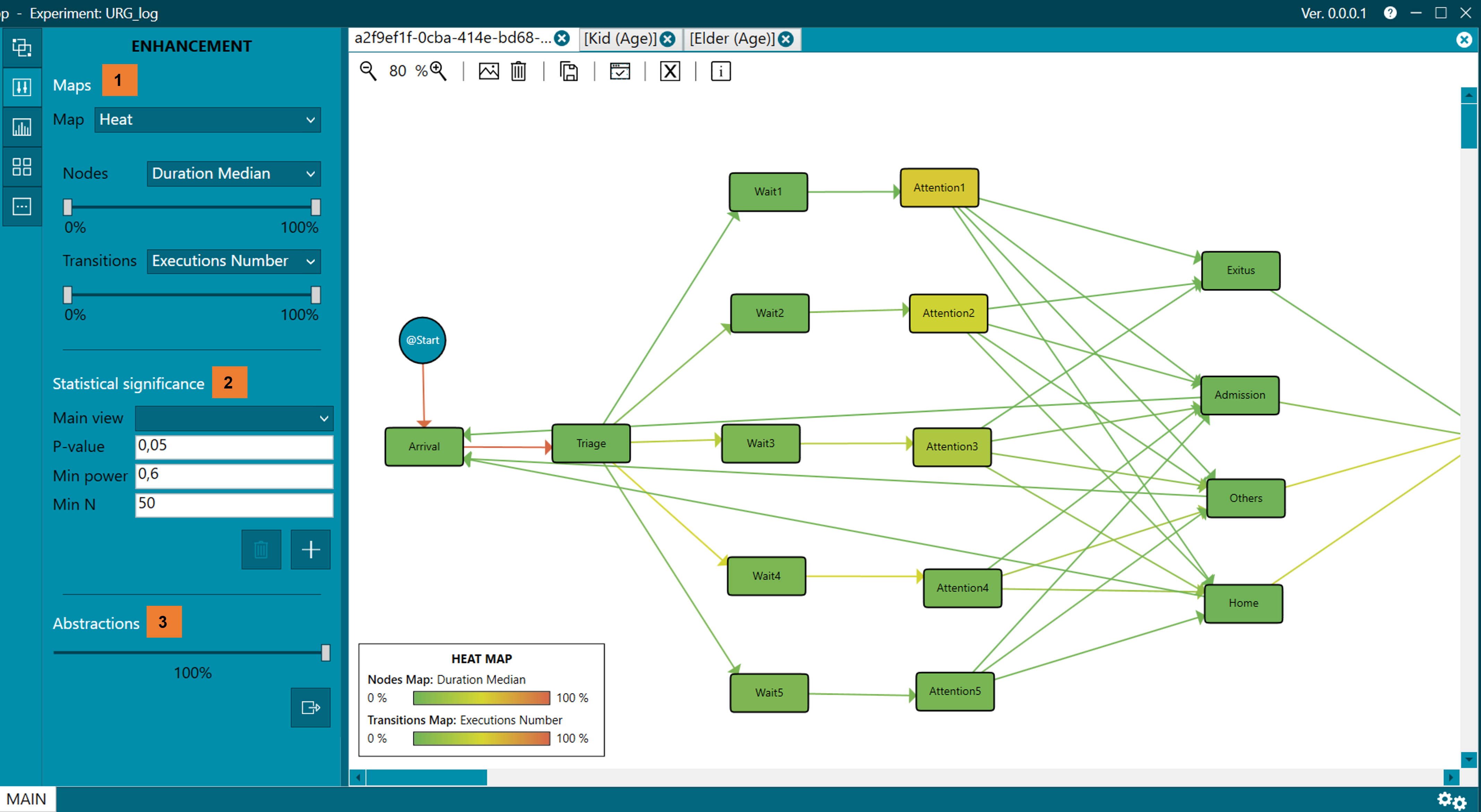
Figure 32. ENHANCEMENT menu
Maps (1)
Depending on the option selected in the drop-down Map, heat maps or difference maps are applied on the process views represented in the MAIN perspective.
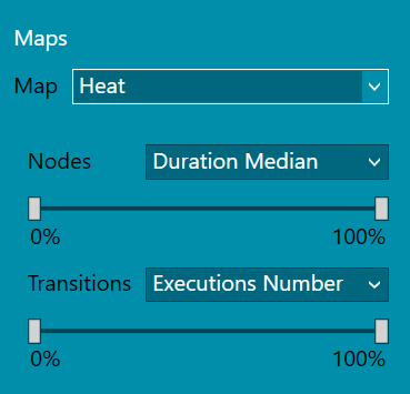
Figure 33. Heat maps
Heat map
When HEAT option is selected, the options to apply the heat maps are displayed and then you can select the criteria with which the nodes and transitions are colored. Taking the Executions Number as an example, the maximum and minimum value of all the executions per transition is chosen and the correspondence with the colors is calculated, green being assigned to the minimum values and red to the maximum values as shown in the figure 34. When modifying the bars with the %, those nodes that have less than, for example 20% of the total Executions Number, is colored in green and those nodes that have more than, for example 80% of the total, are colored in red.
Figure 34. Legend of Heat Map
Colors can be used to represent, for example, the time a patient has spent at each node or the number of patients who have transitioned.
- In the case of nodes, if the default parameters are not modified, green means that patients have spent a short time in the node, while red represents that the time has been long.
- Similarly, in the case of transitions, green by default means that few patients have gone through this transition, while red indicates a greater number of patients going through the transition.
- This "enhancement" or improvement on the map, facilitates the understanding of cases that may occur, such as bottlenecks in the emergency service.
- Within the drop-down with the criteria to apply to the nodes are:
- Executions Number. The number of executions that have passed through that node.
- Traces Number. Number of traces that have passed through that node.
- Duration Summation. The sum of all the time of all the executions that have passed through this node.
- Duration by Trace. The duration per trace is the time spent in a node, that is, for example, in the emergency room, within the same episode, the time that a patient is in Admission would be divided by the total trace time (or episode).
- Duration Average. Average duration of all executions that have passed through a node.
- Duration Median. This is the median duration of all executions that have passed through a node.
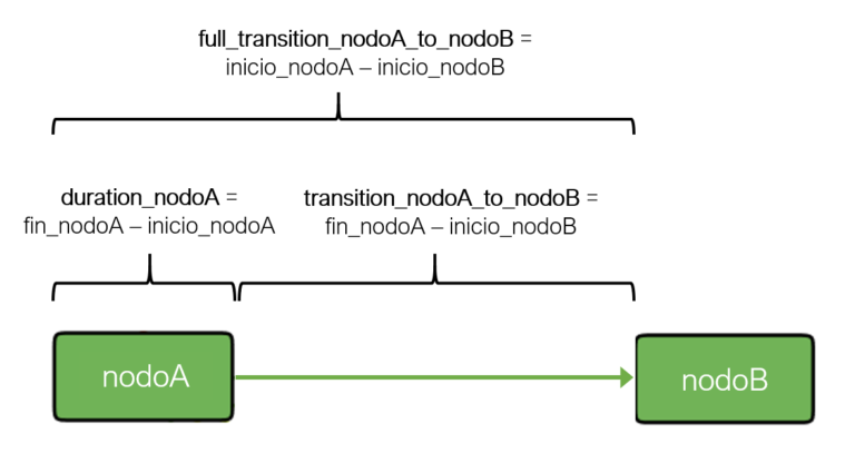
Figure 35. Duration, transition and full transition
The drop-down with the criteria for transitions contains:
- Executions Number. The number of executions that have undergone a transition.
- Traces Number. The number of traces that go through a transition.
- Duration Summation. The sum of all the durations of all the executions associated with that transition, counting the time spent at the node where the transition was born. For example, if we refer to figure 35, the existing transition between the Triage node and Wait1 would have a duration equal to the time spent in the Triage node.
- Duration by Trace. Duration per trace is the time at the node of all runs associated with that transition, divided by the number of traces that pass through the transition.
- Duration Average. Average length of time at the node of all executions associated with that transition.
- Duration Median. Average length of time at the node of all executions associated with that transition.
- Full Duration Average. Average duration of time at the node of all the executions associated with this transition, understanding the transition as the time between the beginning of node A and the beginning of node B (figure 35).
- Full Duration Median. Median duration of time at the node of all the executions associated with that transition, understanding the transition as the time between the start of node A and the start of node B. Changes are applied immediately.
Differences between maps
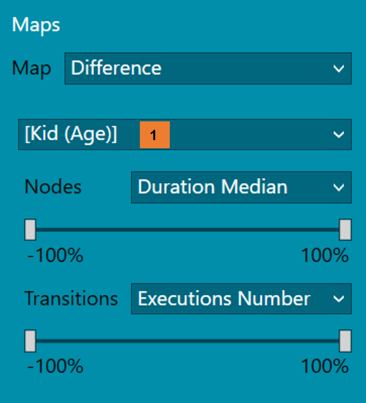
Figure 36. Difference map
- Another possible "enhancement" is the difference between process views (figure 36), which corresponds to the Difference option in the Map menu.
- To do this, you must select the process view through which you want to make the comparison (1). For example, as in figure 38, if the difference maps are calculated taking as a reference the process view "Nivel de Triaje: 1", the comparison is made node by node, that is, of the process view "Nivel de Triaje: 2" the Executions Number of the Arrival node is subtracted the Executions Number from the reference process view.
- As shown in figure 37, the legend indicates the view of the reference process against which the comparison is being made.
- The fewer Executions Numbers there are of difference between both process views, the greener it is shown, on the other hand, the more Executions Numbers there are of difference, the redder it is colored. On the contrary, if the difference is almost zero, the node is shown whiter.
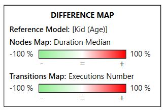
Figure 37. Difference Maps legend
As an example, figure 38 shows the difference between the process view of "Nivel de Triaje: 1" and the process view with patients assigned to "Nivel de Triaje: 4".
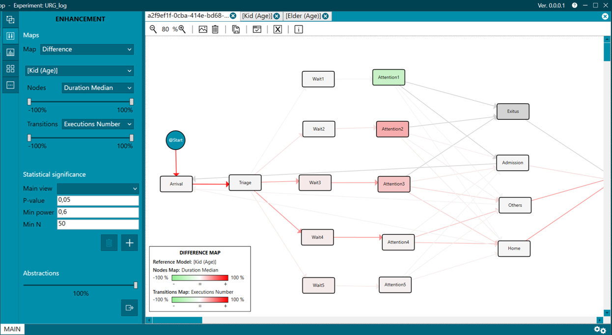
Figure 38. Difference between process views
Statistical significance (2)
Statistical significance is calculated from the process view selected in the Main View drop-down and the rest of the process views, and a node-by-node comparison of the same activity is made, comparing the duration of all executions between these two nodes. For example, the emergency process can be compared between men and women. Parameters can be adjusted. To finish this process, it is necessary to click on the Add statistical significance button. The result will be displayed as it appears in figure 39, highlighting those nodes where there is a significant difference. To "clean" the process views and stop showing statistical significance, click on the Delete statistical significance button. If the tab with the map used to calculate statistical significance is closed, the statistical significance of the rest of the process views will be "cleaned up".
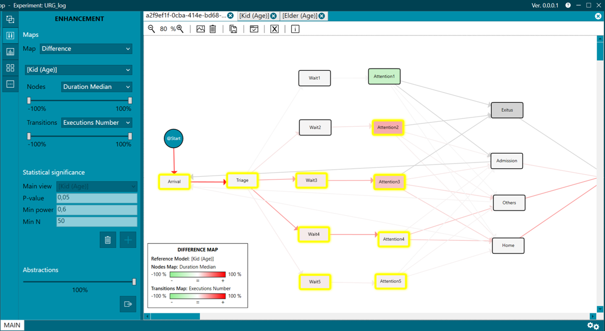
Figure 39. Statistical significance
Abstractions (3)
Finally, we have the abstractions that, as in Groups menu, allows launching a new experiment of a % of the total data in a new PMApp. Although it is not necessary to always extract such data. When selecting the % of the total data that we want to be shown, these are highlighted in the process view automatically, leaving the rest of the data that is discarded a more subdued color, as shown in figure 40.
The calculation of the data selected and highlighted in the process view is done by taking into account the number of executions in each node. For example, if a selection of 80% of the data is made, those nodes with less than 20% of executions are eliminated, keeping the most frequent paths.
To carry out the extraction, you must choose the % of data to be extracted and click the Extract abstraction button.
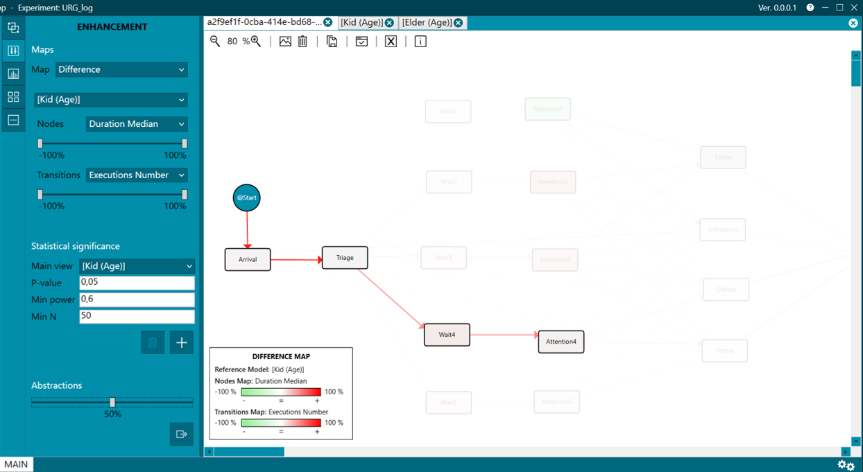
Figure 40. Abstractions