Statistics and Charts
The STATISTICS menu will be displayed by clicking on the third button on the left menu. It is hidden when you click on this same button again. This menu allows you to display statistical information, graphs and tables.
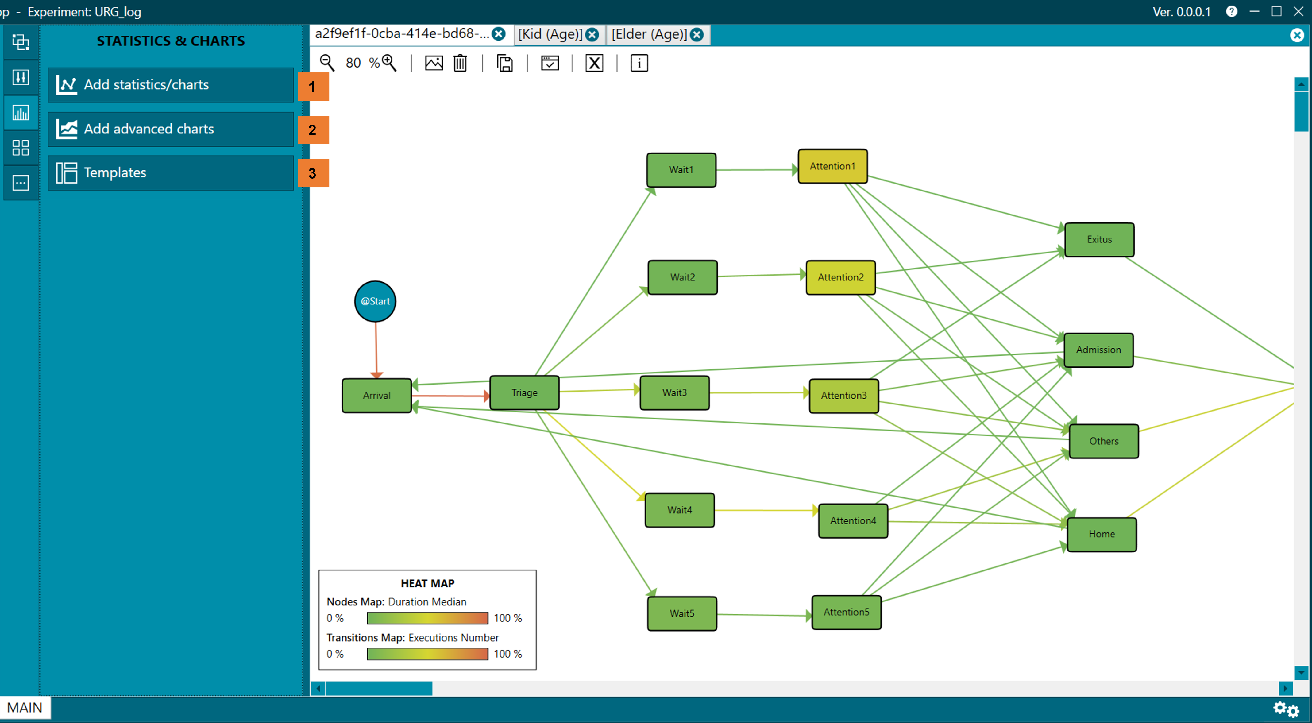
Figure 1. Statistics menu
Add statistics/charts (1)
- To add a new graph or statistic, click on the button Add statistics/charts, this action will open a wizard that will guide us through this process (figure 2).
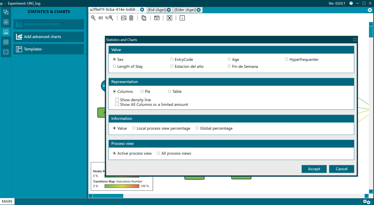
Figure 2. Add statistics/charts wizard
- There, you have to select the following:
- The value you want to represent (Value).
- The type of representation (Representation); which can be in the form of a column chart, pie, table or histogram depending on the type of value chosen in the previous step.
- The information displayed; which can be in absolute values (Value), local percentage (Local View Percentage) or global percentage (Global percentage).
- Whether the scope of the chart should be limited to the active process view or taking into account all of the present tabs.
- Values of type text can be represented in graphs (types: columns, pie and table).
- In the case of the columns chart, a density line can be shown by checking the option Show density line.
- In the pie chart, % can be grouped into a group that will be called OTHER, this will happen when filling in the minimum threshold option (Minimum Threshold __%)
- Values of type numeric can be represented in graphs such as histograms or tables.
Add advanced charts (2)
- You can add an advanced chart by clicking on the Add advanced charts button. This action will open a wizard that will guide us through the process (figure 3).
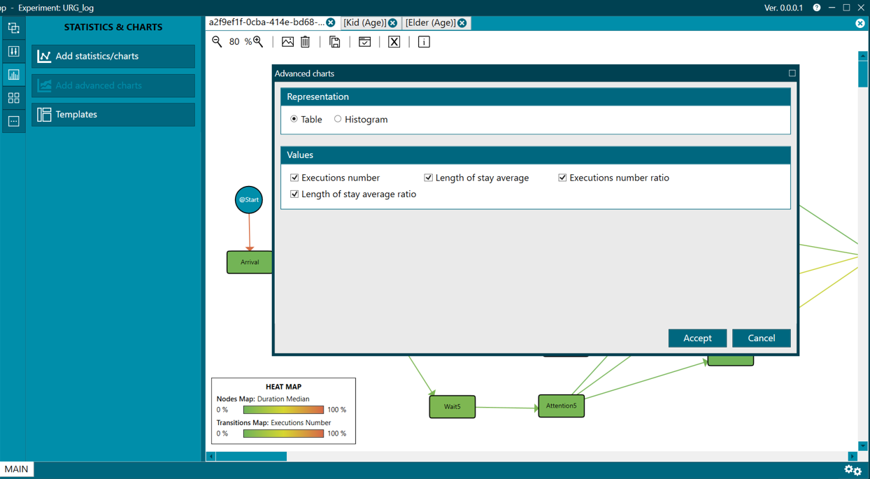
Figure 3. Add advanced charts wizard
- There, you have to select the type of representation you want (Representation), this variable depending on the type of information you have in Values, where they will all appear selected by default.
- The last step to add the graphic is to click the Accept button.
Templates (3)
You can also create templates (templates) so that in future experiments we can show the same graphics that we have saved as a template in a more agile way.
- Templates can be created, loaded and deleted, for which the corresponding option must be chosen (Load, Delete, Create).
- When creating them, you must indicate a name and a description that later helps us identify the type of graphics that we have included.
- Then click on the Accept button.
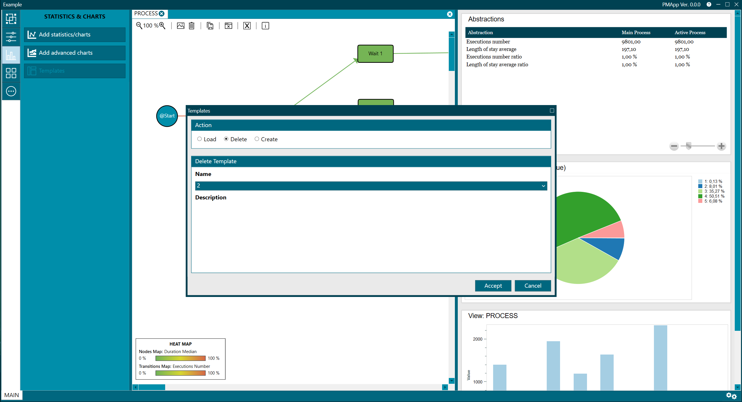
Figure 4. Templates
Each graph (columns, table...) has a menu available that is visible when hovering the mouse over the upper right corner (as shown in figure 5), and (where possible):
- Export to PNG
- Export the data to a CSV file
- Autoscale the chart to fit the available space
- Remove from current window
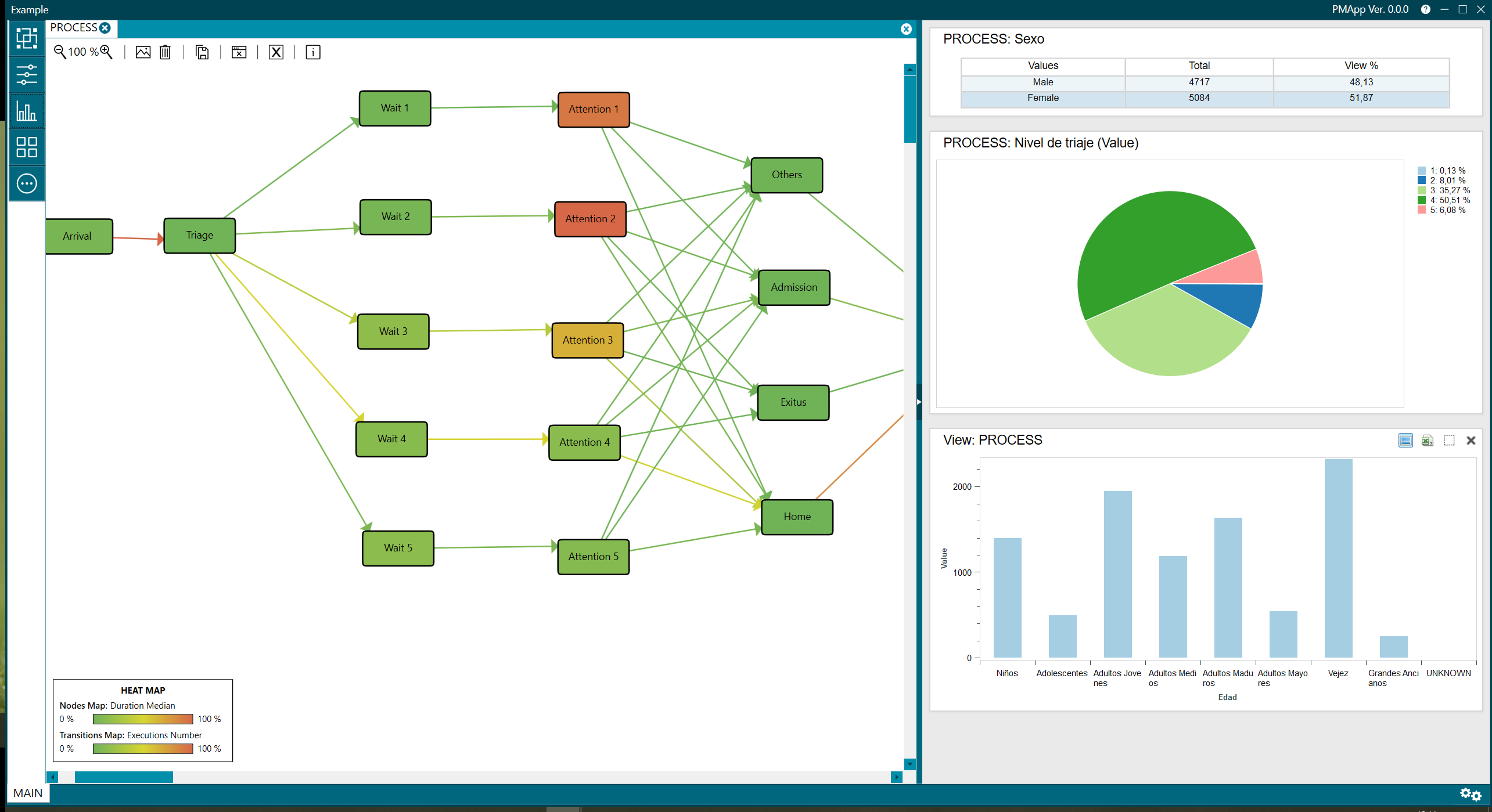 Figure 5. Charts menu
The represented graphics allow to:
- Consult a specific value represented in the chart by clicking with the left mouse button on the corresponding area,
- Scrolling the graph to the left or right by holding right click,
- With Ctrl + right click, it allows to select an area to zoom in, or you can also zoom in and out directly with Ctrl + mouse wheel. To restore the original size of the graph, as mentioned above, click on the Autoscale button available at the top right of the box for each graph.
- In addition, in column charts, if not all fit in the chart, the message Move to see all the columns will be displayed, allowing you to move to the right and left of the chart to see the rest of columns. This is done by clicking with the mouse on the surface of the graph and then scrolling with the keyboard cursors, keeping in mind that clicking the cursor to the right will show the columns to the left and clicking the cursor to on the left, the columns on the right will be displayed.
- When changing tabs, the graphs will be updated showing information related to that process view.